This project describes the process, methods, and outcomes of a project that included multiple usability testing and prototype iterations to propose a GUI and UX for “Efectivo desde mi celular” (Cash in my cell phone) an e-money service established in Ecuador since 2014.
The project explores how a human-centered design approach can help identify and solve real needs and expectations of users strengthening a service that faced a low adoption of use from people.
The outcome of this project included a completely redesigned product and service for Millenials population and established a starting point for considering larger audiences as well as suggestions for future implications and improvements not only for the GUI, but for the features the service could offer.
Finally, it shows what a human-centered design approach might look like within the economic and technological sector.
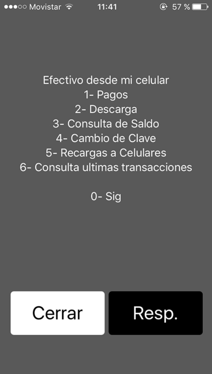
The service used the USSD system for it’s functionality, to access it was required to dial #153.
The project began by conducting an usability testing where participants had to develop different tasks in order to diagnose the current state of the service in terms of navigation, payments and consulting account balance. There were concerns raised around security, the amount of time and repeated steps needed to navigate through the service. On the other hand, users expressed they needed more information and feedback when navigating and a “graphical environment” that helped them achieve their goals.
Data was analyzed using affinity clustering and then synthesized into an “Experience Map” as a visual tool to show the user journey, feelings, satisfaction, insights and to identify pain points and opportunities of the service.
The experience map helped to organize and visualize the user journey and different pain points, opportunities, feelings and general satisfaction of the service.
The problems found were related to navigability e.g. insert password repeatedly, not enough feedback, an exaggerated amount of steps required to complete a task, among others; insecurity e.g. not enough information after a payment, service resetting after some time, having to enter the password repeatedly, among others; and graphic interface, where users claimed they did not felt like they were navigating on a graphic user interface but rather on a “menu” or “list of options”.
This proved that the main issue is related with the USSD system, which although it has several advantages, especially the independence of internet, is not taking into account aspects that could be easily resolved with a graphic user interface and implemented through a mobile app.
Finally, participants expressed the many advantages that this service offers e.g. the amount of time saved because is not necessary to move for making payments.
Two users were modeled, considering all the information gathered on the observation from the first usability testing. Ideal context scenarios were also included showing features and all the different tasks in a regular day using the service.
The six participants involved in the paper prototyping session, constructed the potential screens for the service representing the steps needed to solve different tasks found in the ideal context scenario.
The existing IA was redesigned to fit with an app proposal and to solve different problems found during research and usability testings.
Some of the wireframes created for this phase of the project.
Some of the screens of the first prototype created for the service.
A new usability testing with the first prototype was conducted. Eight participants from different professional backgrounds shared their feelings and gave feedback to improve the proposal.
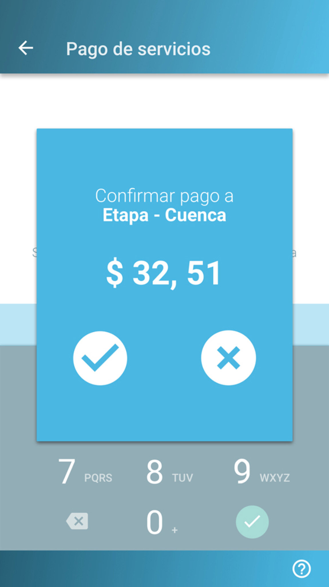
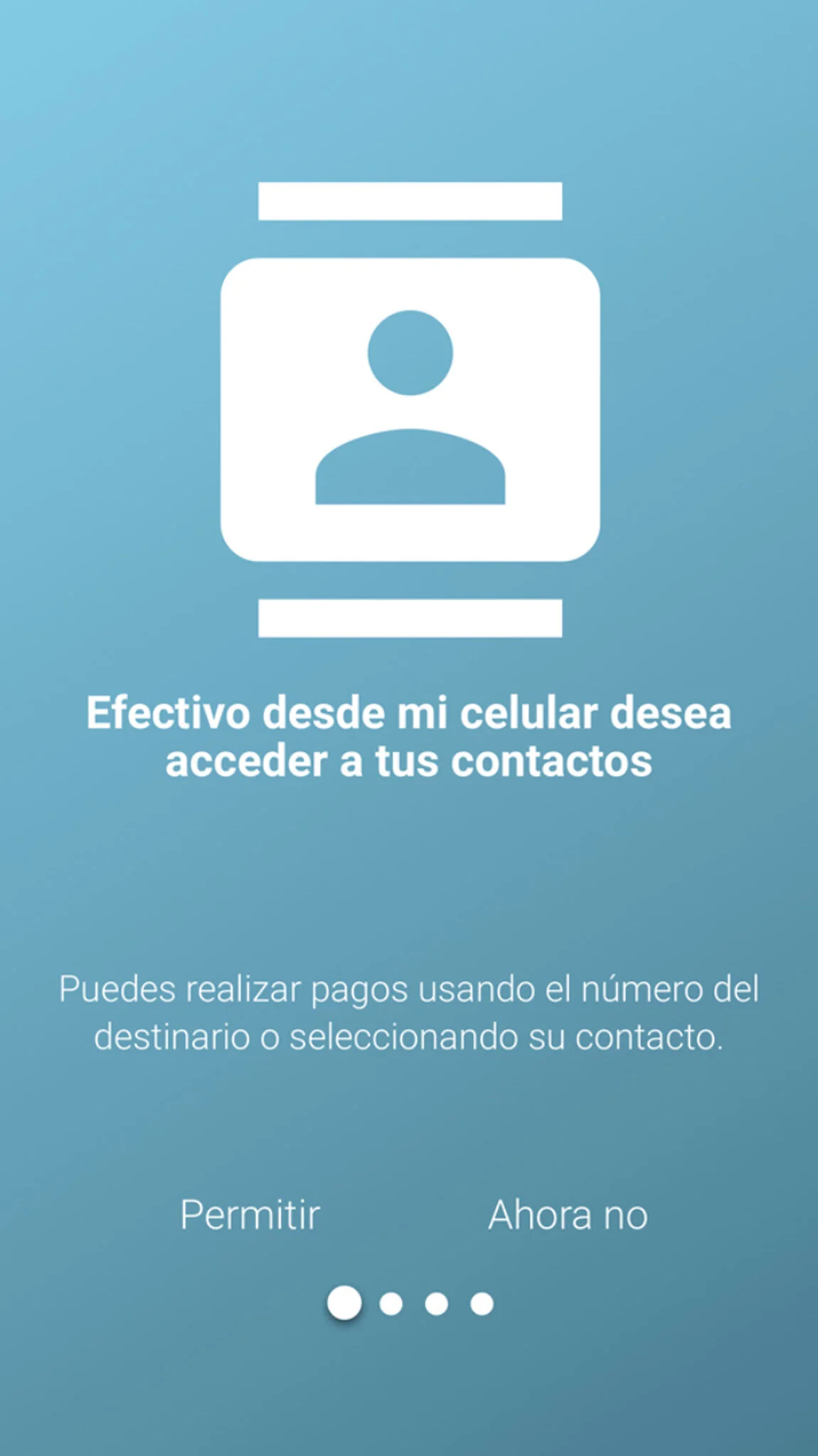
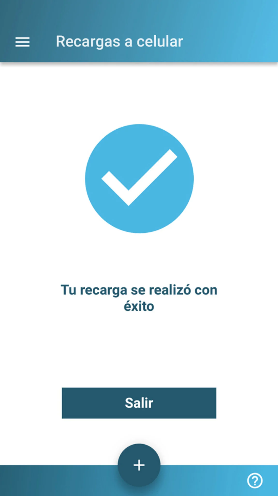
The final interface.


